This page contains affiliate links.
Japandi room lives or dies by its palette — get the colors right and the linen, ceramics, and oak all fall into place. Below you’ll find the four-role formula, a repeatable five-step method for building your own scheme, fifteen ready-made combinations with copy-and-paste hex codes (and one-click Coolors links), real paint colors to sample, and how to keep the whole thing warm under your room’s light.
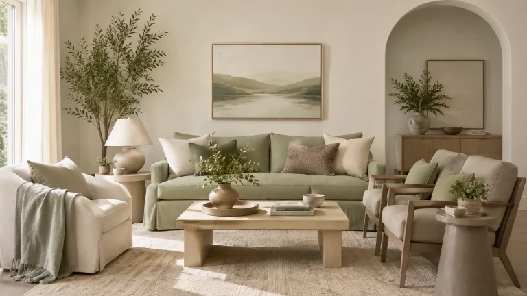
The Japandi Color Formula
Keep your whole scheme to three to five colors built from these four roles:
| Role | What it is | Where it goes |
|---|---|---|
| Base | Warm off-white | Walls & largest surfaces |
| Secondary | Greige / oatmeal / taupe | Sofa, rug, curtains, bedding |
| Grounding | Walnut / espresso / soft black | Wood furniture, frames, anchors |
| Accent | Muted sage / clay / ochre | One cushion, vase, or stem |
The golden rule: warm undertones throughout, matte over glossy, and one accent at most.
15 Foolproof Japandi Color Combinations
Short on time? Copy one of these straight into your moodboard. Each has a one-click Coolors link so you can grab the whole palette, tweak it, and export it.
1. Warm Oatmeal & Walnut (the classic)
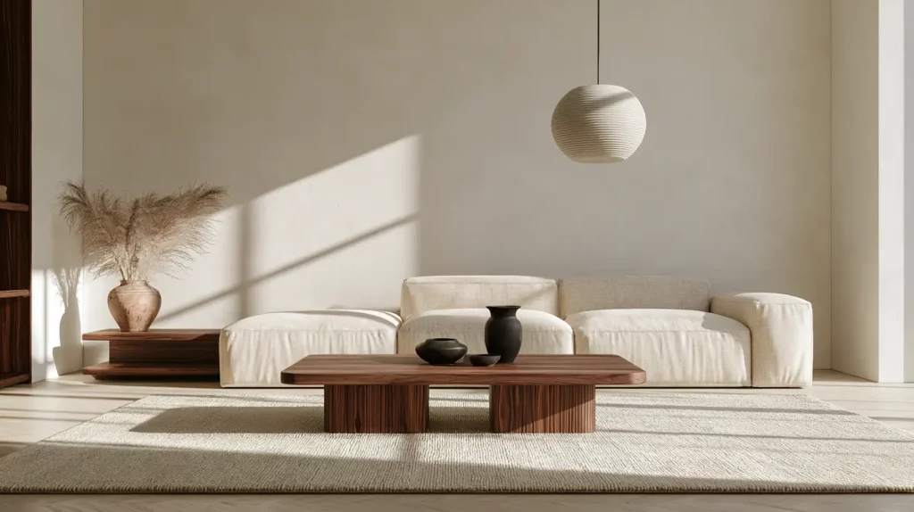
The most versatile Japandi scheme and the safest place to start — layers of warm neutrals, grounded by rich walnut and a soft-black anchor for depth.
| Role | Color | HEX |
|---|---|---|
| Base | Warm White | #F5F1EA |
| Secondary | Oatmeal | #E7DECF |
| Tertiary | Greige | #C9BFB0 |
| Grounding | Walnut | #5B4636 |
| Accent | Soft Black | #2B2724 |
Best for: a whole-home base — living rooms and open-plan spaces. Copy this palette on Coolors →
2. Soft Sage & Clay (bring nature in)
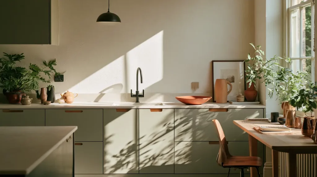
A gently botanical take, with a dusty green and a warm clay working together as soft, earthy accents that bring the outdoors in.
| Role | Color | HEX |
|---|---|---|
| Base | Off-White | #F3EFE7 |
| Secondary | Soft Sage | #A7AE9E |
| Accent | Warm Clay | #B08968 |
| Grounding | Charcoal | #3A3A38 |
Best for: kitchens, studies, and plant-filled rooms. Copy this palette on Coolors →
3. Misty Grey & Blonde Wood (light and airy)
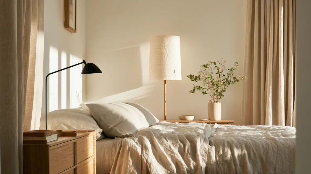
The most Scandinavian-leaning option, kept from turning chilly by the warmth of blonde wood against a soft mushroom grey.
| Role | Color | HEX |
|---|---|---|
| Base | Warm White | #F4F1EC |
| Secondary | Mushroom Grey | #B8B2A7 |
| Wood | Blonde Wood | #D8C3A5 |
| Grounding | Ink | #33312E |
Best for: small or north-facing rooms that need to feel brighter. Copy this palette on Coolors →
4. Cream & Ochre (warm and cozy)
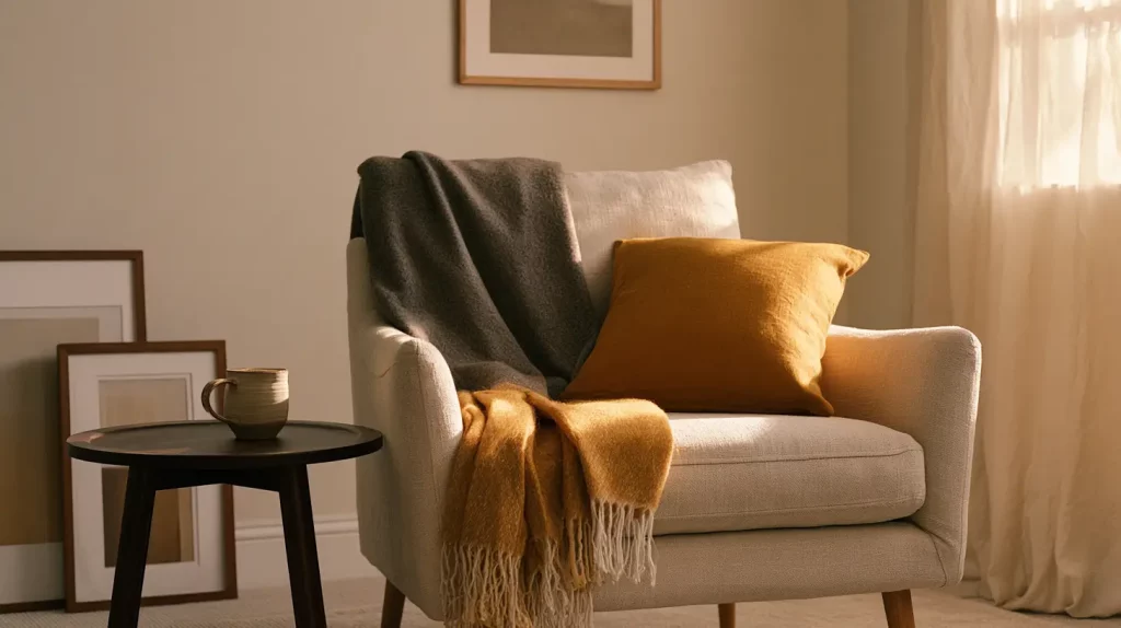
One of the coziest here, with a golden ochre accent that glows under warm light and an espresso base for grounding.
| Role | Color | HEX |
|---|---|---|
| Base | Cream | #F1E9DA |
| Secondary | Taupe | #BBA98F |
| Accent | Muted Ochre | #C69B5B |
| Grounding | Espresso | #4A3B2A |
Best for: bedrooms, reading corners, and autumn refreshes. Copy this palette on Coolors →
5. Paper & Charcoal (modern and graphic)
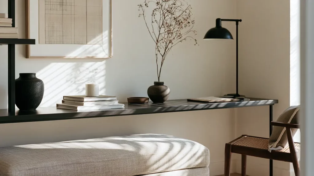
A higher-contrast, gallery-like scheme with a more modern edge — still soft, because the darks are charcoal rather than true black.
| Role | Color | HEX |
|---|---|---|
| Base | Paper White | #F6F4EF |
| Secondary | Stone | #CFC8BC |
| Grounding | Charcoal | #45433F |
| Anchor | Near-Black | #211F1C |
Best for: home offices and entryways. Copy this palette on Coolors →
6. Blush Greige (soft and serene)
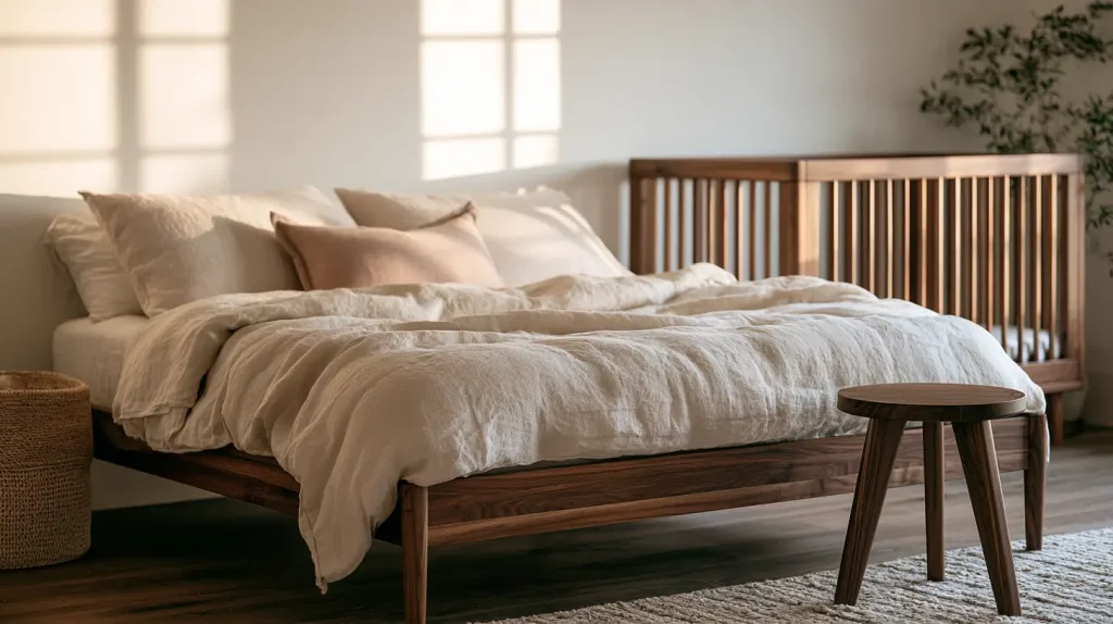
The gentlest palette, with a barely-there dusty rose that reads as a warm neutral rather than pink, warmed further by walnut.
| Role | Color | HEX |
|---|---|---|
| Base | Warm White | #F5EFE9 |
| Secondary | Blush Greige | #D8C7BC |
| Accent | Dusty Rose | #C9A99A |
| Grounding | Walnut | #6B5344 |
Best for: bedrooms and nurseries. Copy this palette on Coolors →
7. Linen & Oak (bright everyday)
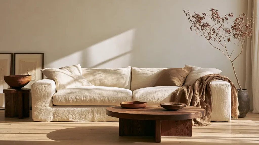
An easy, everyday scheme built on natural oak and soft linen — the most forgiving palette if you’re furnishing a whole room from scratch.
| Role | Color | HEX |
|---|---|---|
| Base | Linen White | #F7F3EC |
| Secondary | Warm Sand | #E3D8C6 |
| Wood | Natural Oak | #C9A87C |
| Grounding | Cocoa | #4E3D2E |
Best for: living rooms and whole-home furnishing. Copy this palette on Coolors →
8. Fog & Cedar (warm neutral)
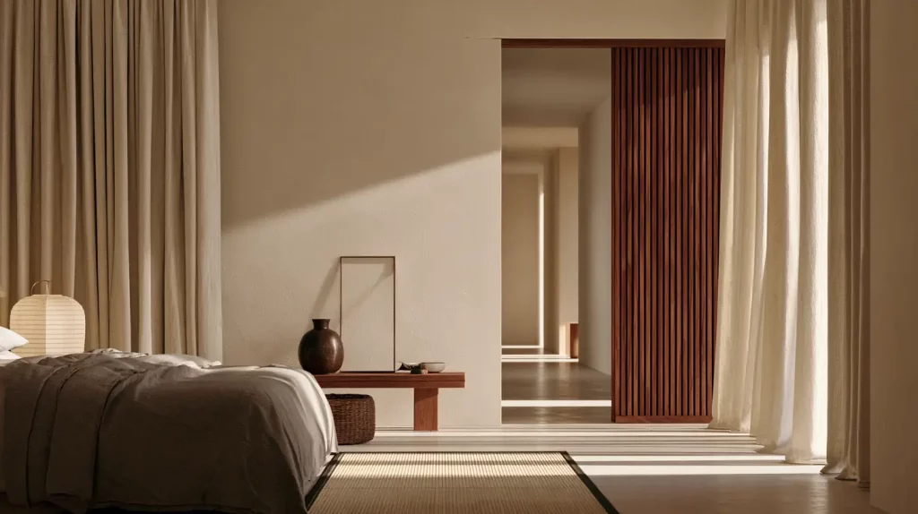
Warm grey fog softened by reddish cedar wood, for a scheme that feels neutral without ever turning cold.
| Role | Color | HEX |
|---|---|---|
| Base | Soft White | #F2EFE9 |
| Secondary | Warm Fog | #C7C0B4 |
| Wood | Cedar | #A26A4A |
| Grounding | Bark | #3E342A |
Best for: bedrooms, hallways, and transitional spaces. Copy this palette on Coolors →
9. Matcha & Stone (muted green)
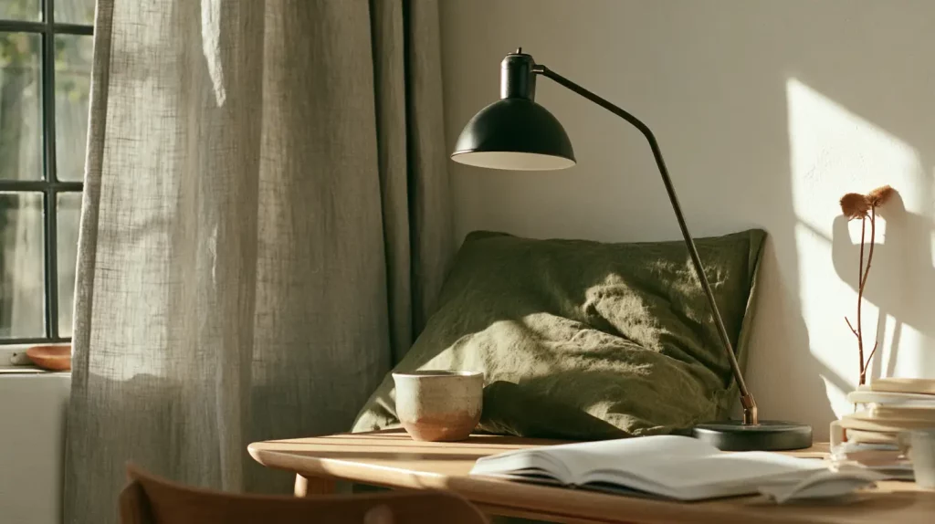
A muted green-grey take, with a soft matcha accent that stays calm and earthy rather than bright.
| Role | Color | HEX |
|---|---|---|
| Base | Chalk | #F1EEE5 |
| Secondary | Stone | #C4BCAD |
| Accent | Matcha | #8C9476 |
| Grounding | Soft Black | #2E2B26 |
Best for: studies, kitchens, and calm work corners. Copy this palette on Coolors →
10. Warm Terracotta (earthy and Mediterranean)
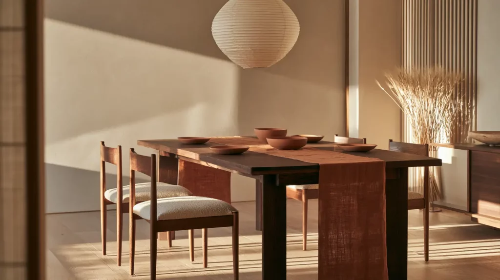
The warmest, most Mediterranean-leaning option, with a muted terracotta that glows against almond and espresso.
| Role | Color | HEX |
|---|---|---|
| Base | Warm Ivory | #F4ECDE |
| Secondary | Almond | #D8C4A8 |
| Accent | Muted Terracotta | #B5714E |
| Grounding | Espresso | #47372A |
Best for: dining rooms and west-facing living rooms. Copy this palette on Coolors →
11. Muted Indigo (calm and deep)
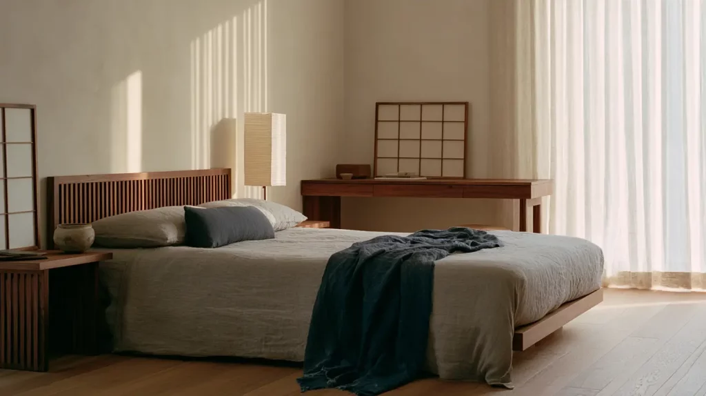
A nod to Japanese indigo dyeing (aizome): one desaturated blue, kept grounded by walnut and warm neutrals so it reads calm rather than cool.
| Role | Color | HEX |
|---|---|---|
| Base | Warm White | #F4F1EA |
| Secondary | Greige | #C6BCAD |
| Accent | Muted Indigo | #4C5A6A |
| Grounding | Walnut | #5A4635 |
Best for: bedrooms and home offices. Copy this palette on Coolors →
12. Mushroom & Rose (soft and enveloping)
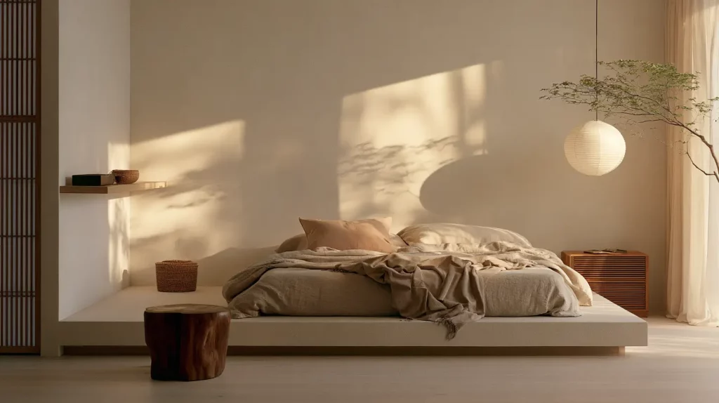
Soft mushroom taupe with the faintest dusty rose — barely-there color that feels warm and enveloping.
| Role | Color | HEX |
|---|---|---|
| Base | Oat Milk | #F5F0E8 |
| Secondary | Mushroom Taupe | #BFB3A4 |
| Accent | Dusty Rose | #C1A091 |
| Grounding | Deep Taupe | #5E4E42 |
Best for: bedrooms and nurseries. Copy this palette on Coolors →
13. Wheat & Espresso (golden neutral)
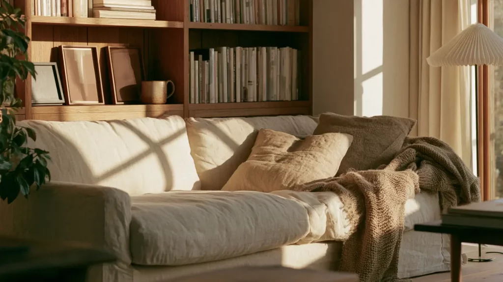
Golden wheat tones over a cream base, anchored by deep espresso wood for a cozy, autumnal feel.
| Role | Color | HEX |
|---|---|---|
| Base | Cream | #F3EBDB |
| Secondary | Wheat | #DCC9A6 |
| Wood | Chestnut | #8B6A45 |
| Grounding | Espresso | #402E20 |
Best for: cozy living rooms and reading nooks. Copy this palette on Coolors →
14. Slate Sage (cool and architectural)
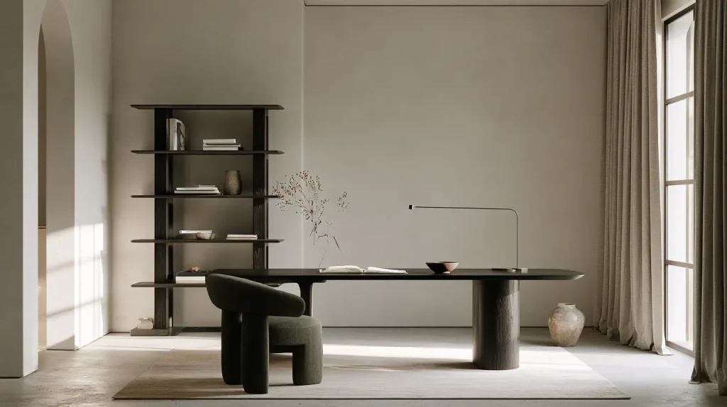
A cooler, more architectural scheme balanced by a sage-grey accent — best where you have warm light to soften it.
| Role | Color | HEX |
|---|---|---|
| Base | Warm White | #F2F0EA |
| Secondary | Slate Greige | #B4B2A8 |
| Accent | Slate Sage | #7C8579 |
| Grounding | Ink | #302E2A |
Best for: south-facing rooms and modern offices. Copy this palette on Coolors →
15. Putty & Black Oak (minimal and grounded)
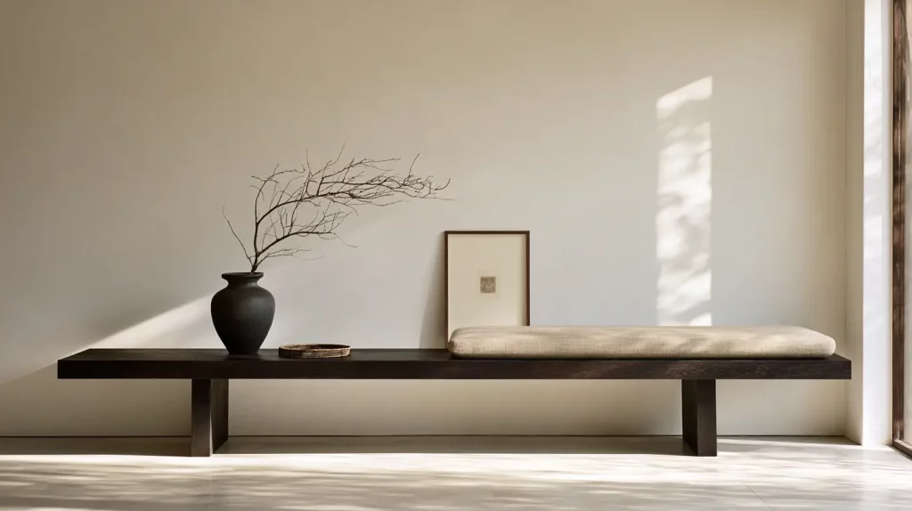
The most pared-back palette: warm putty neutrals and blackened oak, for minimalist spaces that still feel grounded.
| Role | Color | HEX |
|---|---|---|
| Base | Bone | #F4F0E8 |
| Secondary | Putty | #CDC2B2 |
| Grounding | Black Oak | #3B322A |
| Anchor | Soft Black | #22201C |
Best for: minimalist spaces and entryways. Copy this palette on Coolors →
Build your own palettes in Coolors
With Coolors, you can lock in your favorite colors and generate endless color palettes perfect for your home. It’s ideal for simulating room makeovers and choosing colors for furniture or curtains. Why not organize your palettes by theme—like “Living Room” or “Bedroom”—to help bring your dream space to life?

How to Apply Your Palette (the 60-30-10 rule)
- 60% base — walls, ceiling, and large rugs in your warm off-white.
- 30% secondary — sofa, curtains, and bedding in the greige or oatmeal.
- 10% grounding + accent — wood and ceramics for the dark, plus one small hit of your muted accent.
How to Build Your Own Japandi Palette in 5 Steps
Prefer to build from scratch rather than copy a scheme? Work in this order — each step narrows the next, so you never end up with colors that fight each other.
- Start with your wood tone. Your floor and main wood pieces set the temperature of the whole room, so choose the palette around them — not the other way around. Warm honey oak wants creamier neutrals; cool ash or grey-washed wood can take a more Scandinavian greige. (See our visual guide to wood tones to pin down exactly which one you have.)
- Pick a warm off-white base. This is 60% of the room, so rule out anything with a blue or stark-grey undertone. You want a white that looks soft and slightly creamy, never clinical.
- Layer one mid neutral. A single greige, oatmeal, or taupe for the big soft things — sofa, rug, curtains, bedding. Keep it a close cousin of your base, just a step deeper.
- Add one grounding dark. Walnut, charcoal, or a soft near-black in small doses — a frame, a lamp base, legs, a ceramic. This is what stops the room reading flat and washed-out.
- Finish with a single muted accent. One dusty sage, clay, or ochre, repeated two or three times around the room. Then stop — the restraint is the style.
Which Palette Should You Choose?
Match the scheme to your room’s light and the mood you’re after:
| Palette | Feel | Best for |
|---|---|---|
| Warm Oatmeal & Walnut | Classic, safe, versatile | Whole home, open-plan, first-timers |
| Soft Sage & Clay | Botanical, earthy | Kitchens, studies, plant-filled rooms |
| Misty Grey & Blonde Wood | Light, airy, Scandi | Small or north-facing rooms |
| Cream & Ochre | Cozy, golden, warm | Bedrooms, reading corners |
| Paper & Charcoal | Modern, graphic | Home offices, entryways |
| Blush Greige | Soft, serene | Bedrooms, nurseries |
| Linen & Oak | Easy, natural | Whole-home furnishing |
| Fog & Cedar | Warm-neutral, soft | Bedrooms, hallways |
| Matcha & Stone | Muted green, calm | Studies, kitchens |
| Warm Terracotta | Earthy, Mediterranean | Dining rooms |
| Muted Indigo | Calm, deep | Bedrooms, offices |
| Mushroom & Rose | Soft, enveloping | Bedrooms, nurseries |
| Wheat & Espresso | Golden, autumnal | Cozy living rooms |
| Slate Sage | Cool, architectural | South-facing rooms |
| Putty & Black Oak | Minimal, grounded | Minimalist spaces, entryways |
Get the Undertones Right for Your Light
The same off-white can look creamy in one room and grey in another, because natural light changes everything. Choose with your room’s orientation in mind:
- North-facing (cool, flat light): lean warmer. Cream and oatmeal bases with plenty of wood keep the room from feeling grey. This is where the Cream & Ochre and Warm Oatmeal palettes shine — and where you should avoid grey-leaning bases.
- South-facing (bright, warm light): you have room to cool things down. The Misty Grey & Blonde Wood scheme reads fresh rather than chilly here, because the sun warms it back up.
- East-facing: warm in the morning, flatter by afternoon — safest with a soft neutral base you’ve tested at both times of day.
- West-facing: cool mornings, golden evenings. Warm neutrals glow at dusk; just check they don’t look muddy at midday.
Always test before you commit. Screen hex codes and tiny paint chips both lie once color is on a wall. Paint two coats onto a large board (or a peel-and-stick sample), prop it against different walls, and look at it in morning, midday, and evening light before buying a full can. And keep the sheen low — matte or eggshell — because gloss adds glare that fights Japandi calm.
Common Palette Mistakes to Avoid
- Going too cool. Blue-grey neutrals read as clinical. Keep undertones warm; balance any grey with wood.
- Pure white + pure black. Too harsh for Japandi. Use a warm off-white and a soft, near-black.
- Too many colors. More than five and the calm disappears. Cap it and repeat colors around the room.
- A saturated accent. Mute every accent until it feels dusty and natural.
- One flat value. If everything is the same mid-tone beige, add a genuine dark to anchor the space.
FAQ
What colors are used in Japandi?
Warm neutrals (off-white, oatmeal, greige, taupe), natural wood tones, one grounding dark (walnut, espresso, or soft black), and a single muted, earthy accent such as sage, clay, or ochre.
Is Japandi warm or cool?
Warm-neutral overall. Japandi borrows Scandinavian lightness but keeps Japanese warmth, so undertones skew warm. A cool grey works only when balanced with plenty of wood.
What paint colors work best for Japandi?
For walls, warm whites like Benjamin Moore White Dove or Sherwin-Williams Alabaster, and soft greiges like Benjamin Moore Pale Oak or Sherwin-Williams Accessible Beige. For grounding accents, a soft charcoal such as Farrow & Ball Mole’s Breath or Off-Black. Always sample them in your own light before committing.
Which Japandi palette is best for a small or dark room?
The Misty Grey & Blonde Wood scheme — light neutrals plus blonde wood bounce what little light there is, while the warm undertone stops a north-facing or windowless room from feeling cold.
Can I use black in a Japandi room?
Yes — sparingly, and preferably a soft or near-black. A few black accents (a frame, a lamp, a ceramic) add depth without feeling stark.
Do all the wood tones need to match?
No — they just need to share an undertone. Mixing two or three woods looks intentional as long as they’re all warm (or all cool). Keep one dominant and let the others support it.
How many colors should a Japandi palette have?
Three to five in total, including your neutrals. Fewer colors, repeated thoughtfully, is what creates the calm.
Keep Building Your Palette
- Wood Tones Chart: 24 Wood Colors With Hex Codes — pin down the right timber for your grounding tone.
- More color palettes & hex-code guides →
Save whichever palette fits your space, then build the room one honest, natural piece at a time.