Wood tones are the quiet backbone of a room — the floor, the table, the shelf. This wood tones chart maps 24 of the most common wood tone colors from light oak to near-black ebony, each with a copy-and-paste hex color code. Use the chart, the color codes, and the simple mixing rules below to identify your woods and pair them with confidence.
The Wood-Tone Scale (Light to Dark)
Left to right: pale ash, white oak, maple, natural oak, teak, cherry, mahogany, medium walnut, walnut, espresso, wenge, and near-black ebony. Colors are approximate references — real wood shifts with cut, finish, and light — but the order and the undertone are what matter when you pair pieces.
Wood Tones Chart: 24 Wood Colors With Hex Codes
Here is the full visual wood tones chart, grouped into light, medium, and dark. Tap any hex code to copy it — handy for mood boards, digital renders, or matching paint and décor to a floor you already own.
Light Wood Tones
Medium Wood Tones
Dark Wood Tones
Wood Tone Palettes: Warm & Cool Combinations (With Hex Codes)
Single wood color codes are only half the picture — what most people really want is combinations that go together. Here are six ready-made wood tone palettes, each clearly labelled warm, cool, or neutral. Tap any hex to copy it.
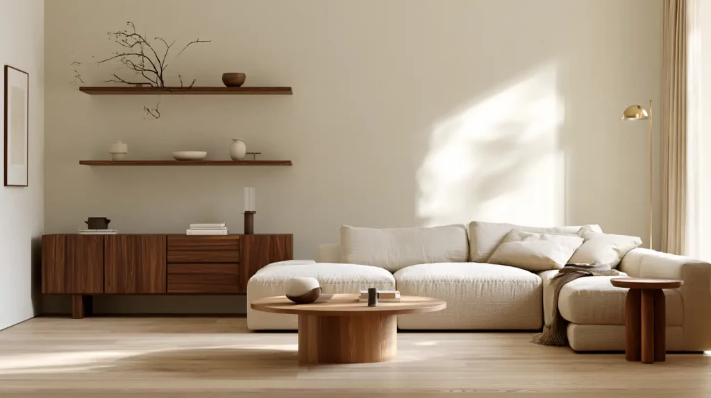
1. Classic Oak & Walnut
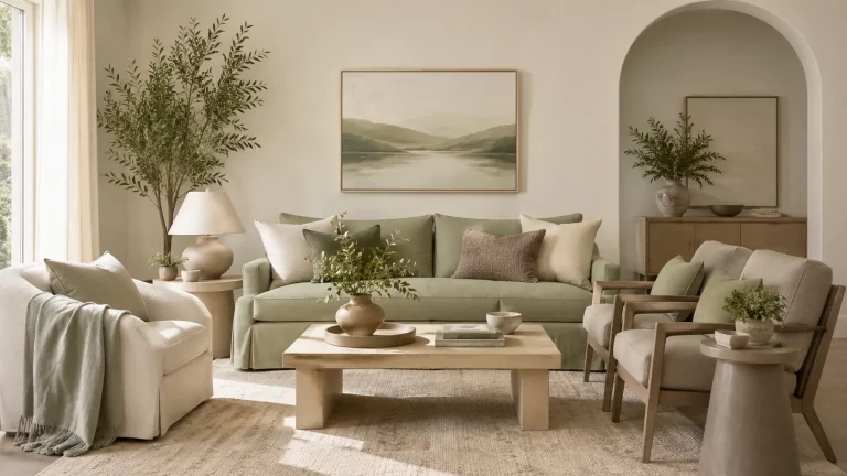
The most versatile warm mix there is: light oak floors with walnut furniture. Undertones stay in the golden-brown family, so it always reads calm — the easiest Japandi-leaning combination. Light oak keeps the room bright while walnut adds just enough weight to feel grounded rather than heavy, which is why this pairing works in almost any space.
Best for: Japandi, Scandinavian, and modern-organic homes — living rooms, bedrooms, or as a whole-home base. Pair with greige or cream walls, natural linen, and black-metal or brass hardware.
2. Honey Teak & Maple
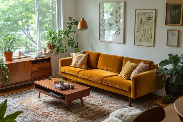
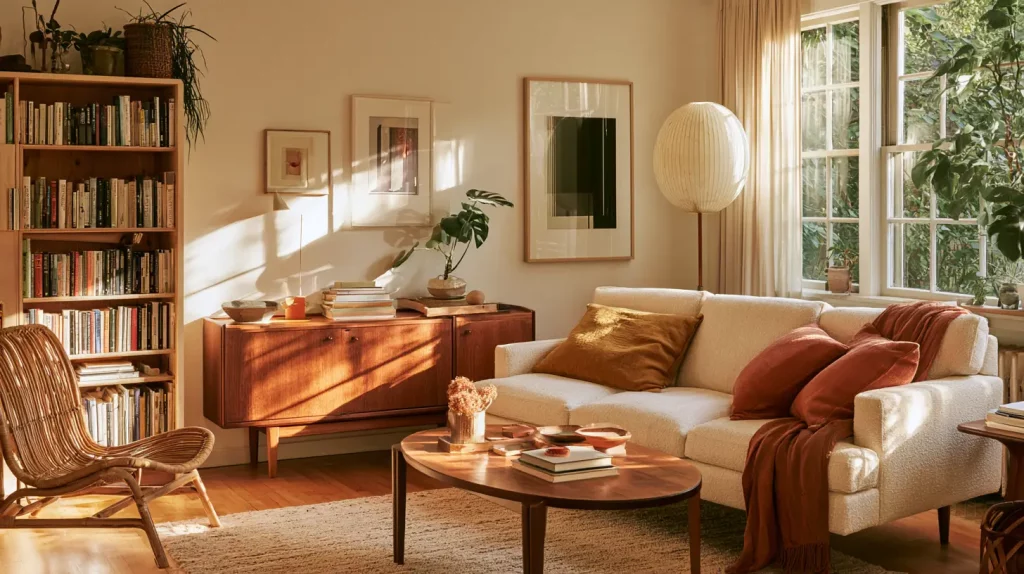
Golden, sunlit and mid-century. Blonde lights with a teak main and one chestnut anchor keep a living room warm without going heavy or dark. The honey-gold range feels sunny and a little retro without ever tipping into orange, so it reads warm and welcoming in daylight.
Best for: mid-century modern, warm boho, and coastal-warm interiors — living and dining rooms. Style it with rattan, cream, mustard-yellow, and terracotta accents.
3. Cherry & Mahogany
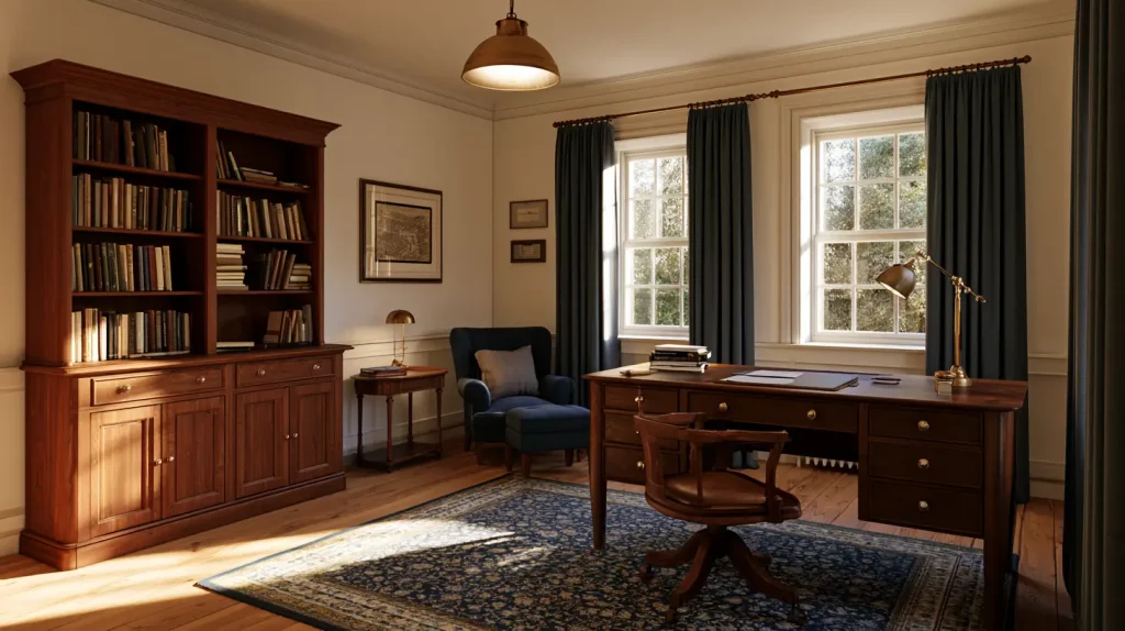
Rich, red-brown and traditional. These warm-red undertones feel cozy and grounded — pair them with cream walls and navy or sage textiles. The deep red-brown anchor gives the whole palette a timeless, heritage feel that suits more formal or classic rooms.
Best for: traditional, grandmillennial, and rustic homes — studies, dining rooms, and cozy living rooms. It pairs beautifully with navy, forest green, brass, and creamy whites.
4. Pale Ash & Ebony
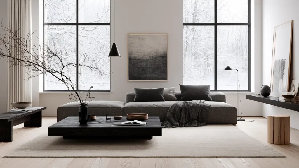
Crisp, modern and Scandinavian. Ashy, grey-leaning lights grounded by a near-black wood — high style with a cool, airy feel. The near-black anchor sharpens the pale, ashy lights for a clean, editorial look that still feels calm rather than cold.
Best for: Scandinavian, contemporary, and minimalist spaces — living rooms and home offices. Keep it cool with crisp white, charcoal grey, and black-metal accents.
5. Grey-Washed Scandi
Soft, calm and bright. Cool-to-neutral pale woods with a single espresso anchor — the safest choice for small or north-facing rooms that need light. Everything stays light and low-contrast, so the room feels open, airy, and serene even when square footage is tight.
Best for: coastal, Scandi, and modern-minimal rooms — especially small or north-facing spaces and bedrooms. Layer with soft grey, white, muted blue, and plenty of linen.
6. Light Oak × Near-Black
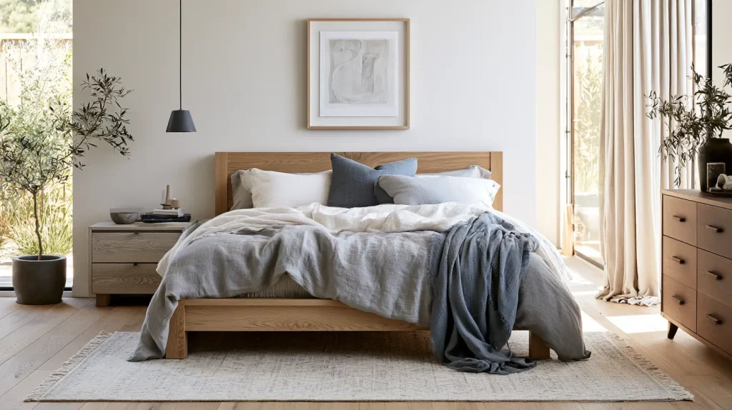
A bold, deliberate pairing rather than a near-miss: pale oak against a near-black wood. Repeat each tone twice and tie them together with a rug or black metal. Because the light oaks read warm-neutral while the near-black reads cool, the overall palette lands balanced rather than clearly warm or cool — here the contrast is about lightness, not temperature.
Best for: modern, contemporary, and Japandi rooms that want one bold moment — living rooms and entryways. Tie the two extremes together with a patterned rug, black metal, and a touch of greenery.
The Three Types of Wood Tones
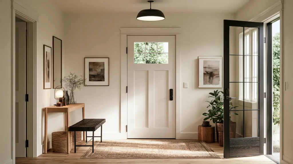
Every wood color on the chart falls into one of three lightness groups. Knowing which group a piece belongs to is the fastest way to plan a room, because lightness controls how heavy or airy the wood feels.
Light wood tones (pale ash through bamboo) reflect the most light and make a room feel bigger, calmer, and more Scandinavian or Japandi. They are the safest choice for small rooms, rentals, and north-facing spaces that need brightening. Medium wood tones (natural oak through mahogany) are the everyday middle ground — warm, golden or reddish, and forgiving. Most mainstream furniture lives here, which is why medium oak and teak mix with almost anything. Dark wood tones (medium walnut through ebony) act as an anchor. A little goes a long way: one walnut table or a black-brown shelf grounds a light room and adds instant depth, but wall-to-wall dark wood can close a space in.
Warm vs. Cool Wood Tones (The Undertone Rule)
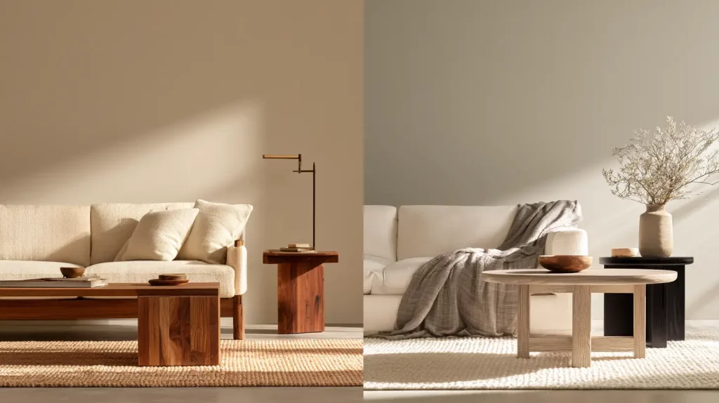
Lightness is only half the story. The undertone — the subtle color hiding under the surface — is what makes two woods clash or click, even when their lightness matches. Most wood tones lean one of two ways:
- Warm undertones pull yellow, gold, orange, or red — natural oak, teak, cherry, mahogany, walnut. These are the cozy, inviting woods.
- Cool undertones pull grey or ashy — pale ash, grey-washed oak, wenge, ebony. These read modern and crisp.
The reliable rule: keep your main woods in the same undertone family (all warm, or all cool), or commit to a clear, deliberate contrast — like pale cool oak against a near-black wood — rather than a near-miss that just looks slightly off.
How to Read a Wood’s Undertone in 5 Seconds
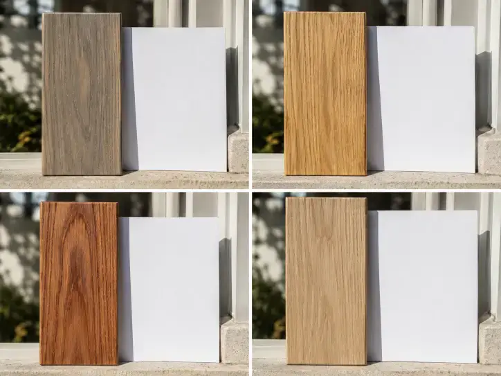
Hold the piece next to a sheet of pure white paper in daylight and look at the raw or lightly finished grain. Whatever color seems to lift off the surface is your undertone: a grey or ashy cast means cool; yellow or honey means warm-golden; orange or red means warm-red. If nothing pulls strongly either way, you have a true neutral (much white oak) — the most flexible wood there is.
How to Mix Wood Tones That Go Together
You do not need everything to match — an exact match often looks flat and showroom-like. To mix wood tones so the room looks intentional rather than accidental:
- Pick a dominant wood — usually the floor — and let it lead the room.
- Limit yourself to two or three tones, and repeat each one at least twice around the space so it reads on purpose.
- Keep undertones in the same family, or go for a clear high-contrast pairing rather than a near-miss.
- Add a bridge — a rug, a woven textile, or black metal — to ease the transition between different woods.
- Mind the scale: put lighter woods on big surfaces (floor, large table) and save the darkest tones for smaller accent pieces in a bright room.
Match Wood Tones to Your Color Palette
Warm woods (oak, teak, walnut) love warm neutrals — oatmeal, greige, cream — plus sage green, terracotta, and navy. Cool or grey-washed woods sit better with cooler, airier schemes: soft greys, crisp white, muted blue. Dark woods act as an anchor, so pair them with light walls and let brass or off-white lift them. For a calm, Japandi-leaning look, oak and walnut together are the easiest, most versatile combination there is.
FAQ
What are the most popular wood tones?
White oak and natural oak are the most popular wood tones in modern interiors because they are neutral-to-warm and pair with almost any palette. Walnut leads the dark end for its rich, versatile brown.
What is the hex code for oak wood?
As an approximate reference, white oak is around #D8C3A5, natural/golden oak sits near #C9A66B, and a grey-washed oak lands around #C9BBA8. Real oak varies with finish and light, so always confirm against a sample.
What is the hex code for walnut wood?
Natural walnut is roughly #5B4636, a lighter medium walnut around #6F5541, and a deep dark walnut near #4A3728.
Do wood floors and furniture have to match?
No. In fact an exact match often looks flat. Aim for tones that share an undertone (or form a clear contrast), and repeat each wood a couple of times so the mix reads on purpose.
Can you mix light and dark wood?
Yes, and it is often the most striking option. Pale oak with a near-black wood is a classic high-contrast pairing — just tie them together with a rug or textile so the jump feels deliberate.
What wood tone works best in a small or dark room?
Lighter, warm-neutral woods like white oak keep a small or north-facing room feeling open and bright. Save heavy dark woods for accents there.
Hex values here are approximate references to help you compare wood tones — real wood shifts with cut, finish, and light, so always check a sample in your own space.