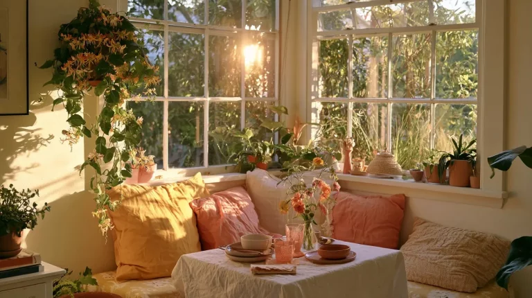
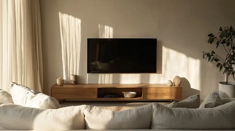
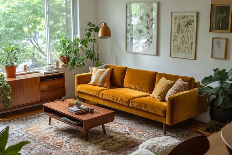
Picking paint is easy; picking a whole room is where most people freeze. This room color palette generator takes the guesswork out of it: choose one base color you love, and it builds a balanced 60-30-10 scheme — a main, a secondary, and an accent — with hex codes you can copy.
Room Color Palette Generator
Pick a base color and get a balanced 60-30-10 palette — main, secondary, and accent — with hex codes you can click to copy.
60% main on walls & large surfaces · 30% secondary on furniture & textiles · 10% accent on decor.
How to use the generator
- Pick your base color. Use the color picker, paste a hex code, or tap one of the preset swatches to start from a designer-tested tone.
- Choose an accent style. Complementary for a bold pop, analogous for a soft tonal blend, or warm neutral for the safest result.
- Read the room preview. The strip shows roughly how the three colors sit together at a 60-30-10 split before you commit.
- Copy the hex codes. Click any card to copy its code, then take it to your paint app, moodboard, or wishlist.
What the 60-30-10 rule actually means
The 60-30-10 rule is the oldest trick in interior design for a reason: it gives every color a job and stops a room from feeling either flat or chaotic. You split the space across three proportions.
| Share | Role | Where it lives |
|---|---|---|
| 60% | Main / dominant | Walls, ceiling, large rugs, big furniture |
| 30% | Secondary | Sofa, curtains, bedding, an armchair |
| 10% | Accent | Cushions, vases, art, one small statement piece |
The magic is in the ratio, not the exact colors. Keep the biggest surfaces calm, let the secondary carry personality, and save your boldest color for the smallest 10% so it reads as a deliberate spark rather than noise.
How the generator builds each color
Rather than throwing random colors at you, the tool treats the color you pick as the hero and builds the other two around it so the whole scheme stays in the same family.
- Main (60%) — a soft, light tint of your base hue. Lightening and gently desaturating your color gives you a wall tone that feels connected to the scheme without overwhelming the room.
- Secondary (30%) — your chosen color, nudged to a mid value that works on upholstery and textiles. This is where your base gets to shine.
- Accent (10%) — a contrasting note calculated from your accent style, dialed to a saturation that pops without shouting.
Which accent style should you pick?
- Complementary (bold pop) — pulls the color from the opposite side of the wheel. Highest energy; best when you want one confident, eye-catching accent.
- Analogous (soft blend) — shifts just a step around the wheel for an accent that harmonizes quietly. Great for calm, tonal, layered rooms.
- Warm neutral (safe) — grounds the palette with a warm walnut-greige that flatters almost any base. The foolproof choice if you are unsure.
5 base colors to try (with ready-made palettes)
Not sure where to start? Here are five popular base colors and the exact palettes the generator produces for each — copy the hex codes as-is, or drop the base into the tool above and experiment.
1. Sage Green + warm neutral
| Role | Color | HEX |
|---|---|---|
| Main · 60% | Soft Green-White | #E8E9E7 |
| Secondary · 30% | Sage Green | #8A9A7B |
| Accent · 10% | Warm Walnut | #896F58 |
Best for: living rooms and bedrooms that want to feel calm and grounded.
2. Terracotta + complementary blue
| Role | Color | HEX |
|---|---|---|
| Main · 60% | Warm Off-White | #EAE7E6 |
| Secondary · 30% | Terracotta | #B0846A |
| Accent · 10% | Denim Blue | #4482A7 |
Best for: sun-filled rooms and Mediterranean or boho schemes.
3. Dusty Blue + complementary terracotta
| Role | Color | HEX |
|---|---|---|
| Main · 60% | Cool Off-White | #E6E9EA |
| Secondary · 30% | Dusty Blue | #6B8E9E |
| Accent · 10% | Burnt Terracotta | #A76344 |
Best for: north-facing rooms that need a warm accent to balance the cool light.
4. Warm Ochre + warm neutral
| Role | Color | HEX |
|---|---|---|
| Main · 60% | Cream | #ECE9E4 |
| Secondary · 30% | Warm Ochre | #C6A15B |
| Accent · 10% | Walnut | #896F58 |
Best for: cozy reading corners and autumn-leaning living rooms.
5. Dusty Rose + analogous
| Role | Color | HEX |
|---|---|---|
| Main · 60% | Blush White | #EAE6E6 |
| Secondary · 30% | Dusty Rose | #B98A8A |
| Accent · 10% | Soft Camel | #B38856 |
Best for: bedrooms and nurseries that want warmth without going pink all over.
How to apply your palette in a real room
- Start big, then go small. Lock in the 60% wall color first, then choose furniture for the 30%, and shop the 10% accent last.
- Repeat the accent at least twice. One lonely accent looks accidental; the same color echoed in a cushion and a vase looks intentional.
- Let wood and metal count. Oak floors, rattan, and brass all read as part of your neutral or accent — factor them in before adding more color.
- Test in your own light. Paint a swatch and look at it morning and night; the same hex can shift a lot between north light and warm bulbs.
Common mistakes to avoid
- Making the accent too big. Once your 10% creeps toward 30%, the balance tips and the room feels busy. Keep it small.
- Choosing three colors of equal strength. A palette needs a clear lead. If everything competes, nothing stands out.
- Ignoring undertones. A cool grey base with a warm accent can clash. When in doubt, keep undertones in the same temperature family.
- Judging a color on screen alone. Hex codes are a starting point. Always confirm with a physical sample before buying paint or a sofa.
FAQ
What is the 60-30-10 rule in interior design?
It is a proportion guide: about 60% of a room in a dominant color, 30% in a secondary color, and 10% in an accent. The ratio keeps a space balanced while still giving it a focal point.
How many colors should a room have?
Three core colors is the sweet spot, which is exactly what the 60-30-10 rule gives you. You can layer in extra shades of those same colors, but adding new hues beyond five or six is where rooms start to feel cluttered.
Find a combination you love, copy the three hex codes, and build the room one honest piece at a time.